
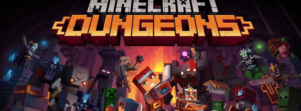
Minecraft Dungeons
I conducted this case study and design update of Minecraft Dungeons as part of a UX/UI course. The goal was to identify friction points in a game that already worked well and design improvements that felt intuitive rather than intrusive. I deconstructed what was there and non-destructively added or reconfigured components to ensure my design choices benefited multiple systems.
UX CASE STUDYCOURSE WORK
2 min read
minecraft dungeons: ux case study
I conducted this case study and design update of Minecraft Dungeons as part of a UX/UI course. The goal was to identify friction points in a game that already worked well and design improvements that felt intuitive rather than intrusive. I deconstructed what was there and non-destructively added or reconfigured components to ensure my design choices benefited multiple systems.
Analyzing the Dungeon Experience
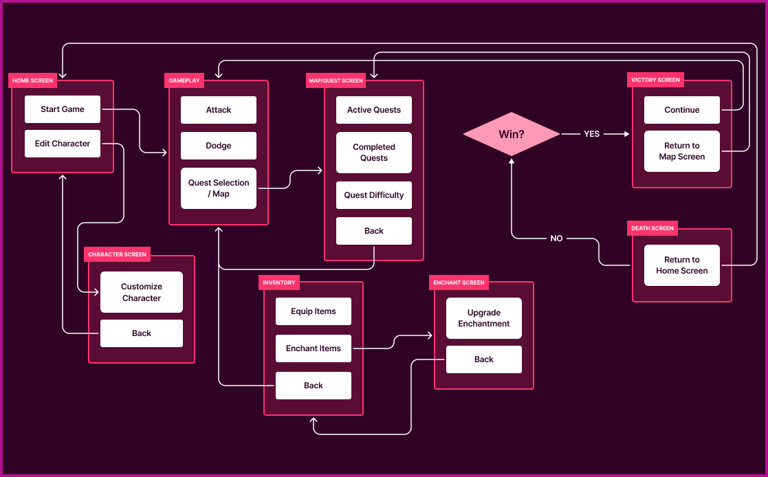
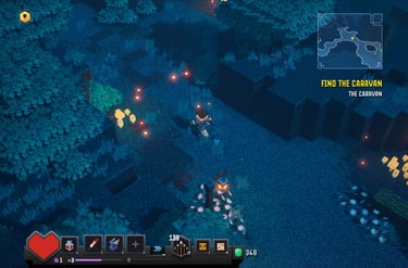
I began my research into the game with an organic playthrough, experiencing the game as any player would. The following day, I played with a designer’s eye to begin deconstructing any friction points found during the first playthrough. It was critical to understand how the game's systems affected one another, and how smooth or satisfying interactions currently were to begin ideating ways to remove friction. With this data, I homed in on HUD consistency, multiplayer and streaming accessibility, and inventory management to support a wider community of players.
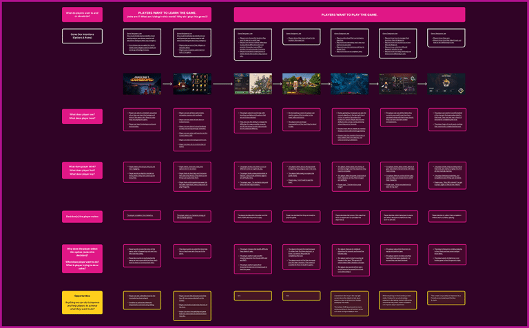
defeating player friction
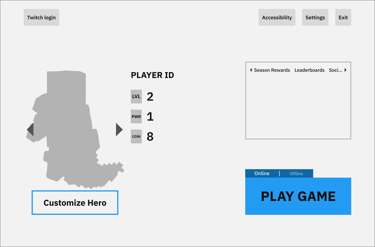
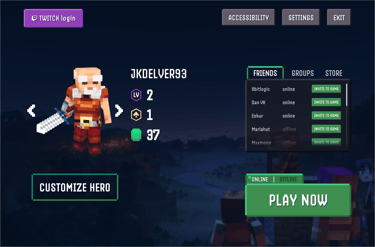
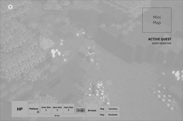
With an online multiplayer mode already in place, I gave it more prominence on the home screen to serve all players, and added Twitch login functionality to serve the streaming audience. I reduced cognitive load for players when switching between single-player and multiplayer by avoiding HUD relocation and resizing, instead left-aligning the HUD so players don’t have to commit two different HUD styles to muscle memory.
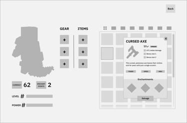
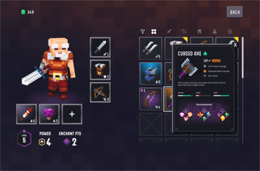
During dungeon runs, the longer the run, the more loot players procure, the more inventory friction they encounter, so I reduced inputs, implemented a floating modal for item details to reduce the number of inputs, and increased the screen real estate for players’ inventory slots. With better screen-space efficiency and fewer clicks, interacting with the inventory system now matches the fast-paced gameplay, creating better cohesion between the two systems.
outcomes & reflections
It’s easy to declare something broken or bad, the harder task is improving something that already works. Analyzing a successful game like Minecraft Dungeons provided a window into high-level UX Design thinking and illustrated for me how integral a good player experience is to successful games. Moreover, it showed me that the best design doesn't announce itself; it just makes the experience feel right, like the game understood what you needed before you did.